
What does it mean to be busy? For example, there was absolutely no time for new posts on the blog, but the topics list is never-ending. I was so busy, professionally and privately. Today we back “on-line”, with a really nice topic.
We can save our time by optimizing daily tasks. Organizing and automating them. And I always try to implement such improvements step by step. No use to complain that there is so much to do and no time for all. The effects may be surprising. Otherwise our frustration can keep growing.
In the matter of programming, we could write here about the tools, such as webpack. But this topic deserves for separate articles. Today we will focus on approaches for writing CSS styles. In a good, comfortable (for us and the others) way. Such codes will be easier to maintain and develop.
“Long term value of the software is directly proportional to the quality of code base…”
— Douglus Crockford
Do you know any other guides and conventions for CSS structure? Like OOCSS, BEM, rscss, SMACSS. Or maybe OMG? Maybe you have seen code samples, that were written using one of these approaches, like BEM or other SMACSS… but you maybe didn’t care about. This article looks closer at the topic of writing better CSS.
Note: personally I write my styles mostly usingSass (SCSS — Syntactically Awesome Style Sheets), so articles and code examples here will be also made using this CSS pre-processor, also known as “CSS with superpowers” 🙂
See more at official website: http://sass-lang.com. Starting work with Sass goes smoothly, especially when we use a framework, that provides a nice support for such technologies (such as Ruby on Rails).
About style giude, in case of JavaScript / ES6, my favorite one is this elaborated by Airbnb:
https://github.com/airbnb/javascript
Same about approach to writing (S)CSS:
Setup of linting tool will help us to keep the right syntax.
NOTE: the only detail I don’t like and don’t use about Airbnb style guide for CSS is about letter case for blocks. In case of fronted-development, I’m not a fan of PascalCase / camelCase.
Certainly in other cases, like writing classes in Ruby / RoR, we use PascalCase, and also snake_case for naming methods. In both cases it’s great and looks good. Just somehow I don’t like it for CSS.
For CSS I prefer kebab-case (spinal-case, hyphen delimited, https://en.wikipedia.org/wiki/Letter_case#Special_case_styles), so I DON’T write any:
.pageHead {}
.sub_header {}
…
BUT:
.page-head {}
.sub-header {}
…
That’s my own preference of course.
Actually there’s so many approaches and conventions, both for JS and CSS. We simply should use those we like, that are nice and reasonable for us. Then let’s follow the conventions we choose, constantly. With this we can really take many advantages for our code development. Without consistency we may create a mess instead.
Let’s start smoothly, from the basic thing — few words about Sass and directory / file structure for our styles.
“Writing CSS is easy. Writing maintainable CSS is hard.”
Why it’s important? For sure I hate to see any “over-engineering” acts, unfortunately it seems to be typical for front-end developers. Therefore we have billions of JS tools, libraries, approaches and so on. But not time for philosophy now, to the point.
Sass vs SCSS syntax
Sass it’s a really awesome thing. It gives us mixins, variables and other facilities, that help us to develop good code faster. In this case we can choose between original Sass syntax (.sass file extensions), and the SCSS syntax (.scss files). I absolutely prefer the SCSS syntax, so my examples will be written using this syntax too.
They both are similar, just with small differences. An example below.
Using .sass syntax
.block  // no opening curly-bracket
  font-size: 1em  // no semi-colons
  color: $text-color
  border: 1px solid $border-color
  // no closing curly-bracket, indents
Using .scss syntax
.block {              // opening curly-bracket
  font-size: 1em;     // semi-colons separating declarations
  color: $text-color;
  border: 1px solid $border-color;
}                     // closing curly-bracket
By the way, a word about nested styles and the “&” operator. Since version 3.3, Sass gives us not only nesting, but also using the selector reference (&) operator, to
generate more advanced selectors. An example:
#main {
  color: #000;
  &-sidebar {
    border: 1px solid;
  }
}
Sass will compile it into this:
#main {
  color: #000;
}

#main-sidebar {
  border: 1px solid;
}
Sass will take care about generating output CSS, proper for the browsers.
And this approach is very helpful in writing styles in conventions such as BEM. Why BEM? This (or other conventions / methodologies) are very useful when building larger projects. As our code grows, we can quickly appreciate this type of approach. More about BEM we will find in part 2/2. In this part we touch more general aspects, as well other conventions (OOCSS).
Example — SCSS + BEM:
// Block (B)
.project-deadline {
  // Block element (E)
  &__date {
    color: $color-red;
  }

  // Block element (E)
  &__header {
    font-weight: 700;
  }

  // …

  // Block modifier (M)
  &--highlight {
    color: $color-green;
  }

  // …
}
The following CSS classes will be created:
– .project-deadline__date
– .project-deadline__header
– .project-deadline–highlight
As far as style guides are concerned, they are gaining popularity in the developers community. And very well. Projects and teams are growing, but no problem when we use a particular styleguide. Both available and commonly known, or developed internally in the team (it may be shared with the community too? :-)).
Consistency, set standards for syntax and formatting, indents, file and folder structures, naming, variables (and even constants), grouping, etc… They just make life easier for us and new members of the team.
Sass and structure of files and folders of our project
To the point. Our code will grow, so it makes sense to group it. We will use partial, as Sass gives us this option, let’s use it. I personally use and recommend the “7-1 pattern”, described here:
In general, we divide our partials in folders by type. There is 7 folders (types), and one main file (at root level, usually main.scss or manifest.scss). This file imports all the partials we need, and make available all the styles we developed inside of these partials.
In non-trivial projects we will see the advantages of this approach quickly. It is worth a try. An example below:
sass/
|
|– abstracts/
|   |– _variables.scss    # Sass Variables
|   |– _functions.scss    # Sass Functions
|   |– _mixins.scss       # Sass Mixins
|   |– _placeholders.scss # Sass Placeholders
|
|– base/
|   |– _reset.scss        # Reset/normalize
|   |– _typography.scss   # Typography rules
|   …                     # Etc.
|
|– components/
|   |– _buttons.scss      # Buttons
|   |– _carousel.scss     # Carousel
|   |– _cover.scss        # Cover
|   |– _dropdown.scss     # Dropdown
|   …                     # Etc.
|
|– layout/
|   |– _navigation.scss   # Navigation
|   |– _grid.scss         # Grid system
|   |– _header.scss       # Header
|   |– _footer.scss       # Footer
|   |– _sidebar.scss      # Sidebar
|   |– _forms.scss        # Forms
|   …                     # Etc.
|
|– pages/
|   |– _home.scss         # Home specific styles
|   |– _contact.scss      # Contact specific styles
|   …                     # Etc.
|
|– themes/
|   |– _theme.scss        # Default theme
|   |– _admin.scss        # Admin theme
|   …                     # Etc.
|
|– vendors/
|   |– _bootstrap.scss    # Bootstrap
|   |– _jquery-ui.scss    # jQuery UI
|   …                     # Etc.
|
– main.scss               # Main Sass file
In such structure we can “lay” our files. BTW — another example at GitHub:
https://github.com/HugoGiraudel/sass-boilerplate/tree/master/stylesheets
NOTE: folder “abstracts” can be names also “utilities”, if we prefer.
And the main file, which can look like this:
@import 'abstracts/variables';
@import 'abstracts/functions';
@import 'abstracts/mixins';
@import 'abstracts/placeholders';

@import 'vendors/bootstrap';
@import 'vendors/jquery-ui';

@import 'base/reset';
@import 'base/typography';

@import 'layout/navigation';
@import 'layout/grid';
@import 'layout/header';
@import 'layout/footer';
@import 'layout/sidebar';
@import 'layout/forms';

@import 'components/buttons';
@import 'components/carousel';
@import 'components/cover';
@import 'components/dropdown';

@import 'pages/home';
@import 'pages/contact';

@import 'themes/theme';
@import 'themes/admin';
An example here (inside of RoR based project):
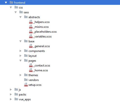
Sample files structure (in Rails 5.1 based project)
I hope this will work well also in your projects. Of course, it’s good to take a look at other architectures:
https://www.sitepoint.com/look-different-sass-architectures
See also:
http://sass-lang.com/documentation/file.SASS_REFERENCE.html
https://www.sitepoint.com/sass-mixin-placeholder
Time for further steps. In this section we will begin with conventions known from OOCSS.
CSS methodologies: OOCSS
We can say that the methodology is quite old. I do not prefer it (generally I prefer BEM), although I used it in one of the projects some time ago. In my opinion it is quite easy to start using this methodology. Maybe our current project more or less follows the recommendations of this methodology, so it will not be difficult to adapt it in our code.
OOCSS — Object Oriented CSS is inspired by the object-oriented programming methodologies. As in OOP, in this case the CSS code is supposed to be re-suable, an organized into the creations similar to “objects”. Easy to use in different places of the web app.
In this approach, the term “object” is defined as a piece of HTML code (a group of elements or a single element), with related CSS classes. A simple search box or a newsletter can be an example of an object.
The basic rules must be followed:
A. Separate structure and skin (define global classes as first, to define general structure of the objects, then more detailed, specialized classed, to define specific appearance of the objects, and variants)
B. Separate containers and content (independent objects, no matter to what container we put it)
Using OOCSS conventions help use to avoid the “spaghetti code”. It focuses on flexible, modular, easily replaceable components.
Example — separate structure and skin:
DON’T do that:
.button-1 {
  width: 100px;
  height: 25px;
  background: #fff;
  border-radius: 5px;
}
DO that:
.button-1 {
  width: 100px;
  height: 25px;
}

.skin-1 {
    background: #fff;
    border-radius: 5px;
}
Usage:
<a class="button-1 skin-1" href="#">Test</a>
Example — separate container and content
DON’T do that:
#sidebar .list .list-body {
  font-size: 13px;
  color: #fff;
  background-color: #d00;
  // dalsze style …
  …
}
DO that:
.sidebar {
  padding: 2px;
  left: 0;
  margin: 3px;
  position: absolute;
  width: 130px;
}

.list {
  margin: 3px;
}

.list-header {
  font-size: 16px;
  color: #d00;
}

.list-body {
  font-size: 13px;
  color: #fff;
  background-color: #d00;
}

…
In a similar way we can create further styles, eg:
– .btn {} // structure
– .btn-blue {} // skin
and variants, such as different “skins”
A good idea is also to separate the elements by size:
– .btn-small {}
– .btn-medium {}
– etc …
and other variants of our “objects”.
With Sass even better and easier
This simple example shows the use of Sass features for writing neat OOCSS. As first we define placeholders, keeping in mind the rules of OOCSS:
%button {
  min-width: 130px;
  padding: 1.1em;
  border-radius: 1.2em;
}

%twitter-bg {
  color: #fff;
  background: #55acee;
}

%facebook-bg {
  color: #fff;
  background: #3b5998;
}
Then we apply them, using the extend (https://sass-guidelin.es/#extend) method:
.btn {
  &--twitter {
    @extend %button;
    @extend %twitter-bg;
  }
  &--facebook {
    @extend %button;
    @extend %facebook-bg;
  }
}
That’s all:
<a href="#" class="btn--twitter">Twitter</a>
<a href="#" class="btn--facebook">Facebook</a>
It is not about black magic. It is about meaningful organization of styles for specific elements of the page, as we consider objects by writing OO-like code.
As a programmer, who wrote OOP code for years, I can say that for some time (more or less consciously) I used some OOCSS rules when writing frontend codes. Later on, I also became interested in other approaches. OOCSS it OK, but honestly, for me it’s too old-school… And I don’t know how well it would be playing in a real, huge project.
Once I used also the RSCSS (https://github.com/rstacruz/rscss) methodology, however, it didn’t fully meet my expectations. So far, BEM is my favorite approach (more about BEM in Part 2).
Resources
https://www.keycdn.com/blog/oocss
https://toddmotto.com/getting-started-with-object-orientated-css-oocss-creating-a-button-kit
http://www.nicoespeon.com/en/2013/05/dive-into-oocss
https://www.smashingmagazine.com/2011/12/an-introduction-to-object-oriented-css-oocss
http://saddamazad.com/2015/12/object-oriented-css-with-sass
CSS structure and conventions — summary
We described a way to organize folders and files with our CSS / Scss codes, that some (or hopefully more) people could like and use in own projects. We also have an overview of OOCSS approach. In next part we will say more about other methodologies and conventions, so they can be compared.
The approaches are just some way of thinking, and sets of couple rules to follow. However consistent use one of them, may brings really big advantages for the project and the team.
Happy coding!
 Posted in
  Tags:
Tags: 