
Hello dev-friends! Let’s continue the topics discussed in part I.
Today we will look closer at different CSS writing methodologies, such as BEM, rscss, SMACSS. It should be also mentioned, that the methodologies can be combined (eg OOCSS + BEM). Of course only if it makes a sense to us. That’s actually important thing. It’s not so good to use sucking things only because they are so “cool” now, so trendy and so on. It doesn’t matter — in next days, weeks or months there something “completely new and awesome” will appear 😉 But this is a separate topic, on which I don’t want to waste the time 😉 OK, to the point.
CSS methodologies: SMACSS
Let’s start with SMACSS. And I have to say I never used this approach of organizing and writing CSS in real-life project. It’s not about SMACSS sucks or something like that. Simply this methodology is not comfortable for me. For sure it has many advantages, just for me some details are annoying. BUT, of course, it may be very good and comfortable for the others. It’s up to you! So…
SMACSS (Scalable and Modular Architecture for CSS), created by Jonathan Snook, is a style guide for CSS code. In this approach we organize the CSS code by categories (Base, Layout, Module, State, Theme). Let’s look at them closer.
Base
Basic styles, general. This style group is responsible for default values; default appearance of page elements (margins, input, fonts, example: normalize.scss).
Layout
Layout styles define the appearance and placement of typical web and page elements, such as header, footer, sidebars. In SMACSS (and not only) it is assumed to use the prefix “l-” for them.
Module
Modules in SMACSS are independent, reusable code blocks (UI), such as menu, search box, list items, etc. We can say that they are something like blocks in BEM. Modules are usually located in containers, inside layout elements.
The assumption is that each module should be independent of the other modules. It should work the same way in every container we put him in. Therefore, do not create styles that are dependent on the parent container.
As an example we can consider the menu module:
…

.menu {
  background: #00a;
}

.menu h1 {
  font-size: 20px;
}

.menu .menu-item {
  border: 1px solid #000;
}
…
State
They simply define the appearance of the element’s state, depending on the situation (e.g. hidden, expanded, etc). We collapse or expand menu, make elements visible or hidden, move cursor over an element, and other such situations.
Example:
<div class="menu is-expanded">
  …
</div>
It is recommended to define such logical states with the “is-” prefix, e.g. “is-active”.
Theme
Themes are usually found in larger projects, where variants exist (for example: daily, nightly, sexy, sunny, etc), which define different look (and feel) for Module and Layout elements of the project.
SMACSS — example 1:
// Layouts
.l-default {}

// Modules
.m-accordion {}

// States, mostly with prefix like "is-"
.is-active {}
.is-hidden {}
SMACSS — example 2 — mediaqueries:pu
.m-navigation {
  &:after {
    @media screen and (min-width: 767px) {
      content: '';
      display: inline-block;
      width: 100%;
    }
  }

  li {
    display: block;

    @media screen and (min-width: 767px) {
      float: left;
    }
  }
}
See also
This author created his own guide style based on SMACSS and OOCSS:
https://github.com/timhartmann/Scss-Styleguide
And the author of SMACSS runs the website (https://smacss.com), where we can buy or read on-line a book about this CSS methodology:
https://smacss.com/book
Let’s get to know other methodologies 😎 It is also not a surprise that we will find the similarities between them.
CSS methodologies: rscss
RSCSS presents a different approach, principally quite simple (it’s smaller comparing to the others). We can start using it quickly; it may be good to start with, if you are not using any methodology yet.
RSCSS — Reasonable System for CSS Stylesheet Structure is a CSS style guide with simple set of assumptions. In rscss every “building block” is a component. In addition to components, we also distinguish between elements, variants and helpers.
Component — a single “piece” of UI code, easily reusable in many places of the app; contains elements.
Element — HTML tags inside of the components.
Variants — variations of default appearance (look and feel) of an element.
Helpers — utilities, general purpose tools.
When I was developing a small front-end using Bootstrap, rscss and Slim templates (http://slim-lang.com), I didn’t like the “_” prefix recommended for helpers. Code like this was weird:
…
.clearfix
._divided10
…
Presently, and no matter what methodology using, my helpers always have the “h-” prefix, e.g.:
.h-divided10
Rscss — a simple example:
// ----------------------------------------------------------------
// Search form component.
// ----------------------------------------------------------------
.search-box {
  > .label {
    font-weight: 500;
    color: $color-base-blue;
  }

  > .field {
    // …
  }

  // > input …

  > .button {
    // …
  }

  // Variants.
  &.-basic {
    color: $color-base-red;
  }

  &.-extended {
    color: $color-base-blue;
  }

  &.-hidden {
    display: none;
  }

}
See also:
https://github.com/rishabhp/rscss
CSS methodologies: BEM
Finally, it’s time for BEM! It’s my favorite approach, that I use in my projects.
BEM (Block Element Modifier) is a methodology elaborated by Yandex developers. This is a fairly simple approach to creating modular, reusable CSS code.
BEM frees us from cascading. We apply only the styles, that we really need. Also, the main blocks do not depend on other elements. In that way it’s much easier not only to maintain and modify the code, but also to move (blocks) to other places, and even to another project.
In the assumptions BEM is to be:
– simple — the basis relies on the use of the BEM naming convention
– modular — independent blocks and CSS selectors
– elastic — we have a lot of room to make BEM comfortable — just as we like it
Note: it’s good to know, that BEM was created for projects, that have to be released quickly, BUT maintained in a long (long-term) perspective. And it works great in that matter.
In BEM we see our code as:
– blocks — for example a simple, stylized button, menu or extended form — we think of the block as a re-usable component in our project (examples: header, container, menu, checkbox, input)
– elements — individual elements, eg a button consists of a link, with a text and a picture, the form has input elements, etc … (examples: menu item, list item, checkbox caption, header title)
– modifiers — these are just additional classes, that modify the appearance of a block or element depending on the state, e.g. an active menu item after hovering over the cursor (examples: disabled, highlighted, checked, fixed, size big, color yellow)
The BEM methodology gives a simple and understandable structure. We create styles based on the conventions of names.
BEM — naming convention
BEM has following naming convention for CSS classes:
.block — the first word in the name means that the class applies to the given block
__element — two underlines mean that the given class concerns the element
–modifier — two dashes define the modifier
Example:
// Block
.block {}

// An element associated with the block
.block__element {}

// Modifier of the block
.block--modifier {}

// Modifier of the element
.block__element--modifier {}
It’s all about the basic naming convention. Our task is simply to think about how to organize styles to reflect the requirements of our project, elegantly and comfortably.
We can also say that BEM encourages us to think twice before we complicate things unnecessarily. Examples below.
Block represents and object, e.g.:
– a person
– a menu
– a sign-in form
– a search box
etc.
Element is a part of block, which does some defined role in his context, e.g.:
– a head (of the person)
– menu item
– a label, button or input field
etc.
Modifier determines how to represent variations of a block or element, e.g.:
– high / low person
– active — highlighted menu item
– expanded / collapsed input of the search form, collapsed block
etc.
Examples:
// Menu
.menu {}
.menu__item {}
.menu__item--is-active {}

// Person
.person {}
.person__head {}
.person__hand {}
.person--female {}
.person__hand--left {}
In this way, we know that the head or hand refers to the context of the person. After decapitation, we could have separate classes, e.g.:
.head {}
.left-hand {}
Only remember, that the head can belong to a person, but also for the dog, cat, monkey, etc. And in each case it will look different 🙂
Sass features support significantly writing of a code compatible with BEM.
Example — mixin:
@mixin button {
  padding: 0.6em 0.7em;
  // style …
}

.button {
  @include button;
  background-color: $color-red;
}

.button--secondary {
  @include button;
  background-color: $color-green;
}
BEM — good practices
In a hurry, we can quickly start writing bizarre or unnecessarily complicated styles. For BEM, there are a bunch of rules defined by programmers using it to avoid traps.
A. Use unique names for blocks (CSS classes).
B. Do NOT use ID selectors, neither HTML tag / cascade-base (childs) selectors (for everything we can define CSS class).
Take a look, it’s simply better to use selectors like
.score–in-progress
instead of:
#scoreboard> li> b + span
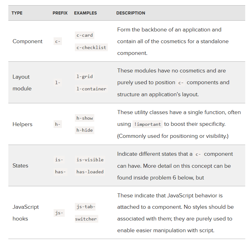
C. Prefixed namespace. Can we also use some prefixes? Certainly!
For example, for the modifiers we can use ‘is-‘ or ‘has-‘:
.is-active {}
.is-hover {}
.is-dragged {}
For the selectors to work with JavaScript (to refer in JS code) we can add the ‘js-‘ prefix:
.js-sortable {}
.js-is-active {}
.js-drag-and-drop {}
For helpers => ‘h-‘, for the layouts => ‘l-‘, etc.
отчет по форме 2 тп отходы это
D. Don’t chain BEM elements — so if our class looks like this:
.form__row__input
there IS something WRONG. It’s better to link “grandchildren” directly to the block, or create a separate block for them.
In BEM, we create our own virtual namespace for specific elements (inside of the block), and thus avoid conflicts (e.g.: .nav__item {} and .menu__item {}, and NOT .item {}).
But…
E. Note on nesting. It’s about a sensible nesting of styles, above all — NOT too deep.
Example — BAD, don’t do that:
.person {}
.person__head {}
.person__head__face {}
.person__head__face__eye {}
.person__head__face__eye__pupil {}
// etc …
Example — GOOD:
.person {}
.person__head {}
.person__face {}
.person__eye {}
.person__pupil {}
// etc …
It’s better if double underlining appears in the selector’s name once. So we write:
Block__Element–Modifier
AND NOT:
Block__Element__Element–Modifier
E.g. if we have a form ‘search-form’, and in it a div ‘search-form__content’, which contains inputs, the CSS classes for the inputs we can write in two ways:
WE DON’T WRITE:
// bad
search-form__content__input
BUT
// good
search-form__input
OR
// also good
search-form__content-input
Both versions are correct — recommended by the BEM documentation.
Take a look on further samples.
Example — AVOID this:
<!--Bad-->
<div class="c-card">
  <div class="c-card__header">
    <!-- Grandchild -->
    <h2 class="c-card__header__title">Title text here</h2>
  </div>

  <div class="c-card__body">
    <img class="c-card__body__img" src="pic.png" alt="description">

  …
</div>
Now let’s see the same code with the corrected selectors.
Example — DO THIS:
<!--Good-->
<div class="c-card">
  <div class="c-card__header">
    <h2 class="c-card__title">Title text here</h2>
  </div>

  <div class="c-card__body">
    <img class="c-card__img" src="pic.png" alt="description">
  …
</div>
Huh?
Similarly:
<div class="block">
  <div class="block__elem1">
    <div class="block__elem2">
      <div class="block__elem3"></div>
    </div>
  </div>
</div>
.block {}
.block__elem1 {}
.block__elem2 {}
.block__elem3 {}
And so on.
Why? Let’s build our components in a smart way. BEM (or another convention) is to help us, not limit us, or complicate simple things!
Tip: for multi-member name parts of the selector (blocks, elements or modifiers), we simply use a hyphen, e.g.:
block-name__my-element-name–foo-bar-modifier-name
The naming scheme is recommended, though not the only one: https://en.bem.info/methodology/naming-convention/#alternative-naming-schemes (BEM is being developed for a longer time ;-))
More about good practices and pitfalls:
https://www.sitepoint.com/working-bem-scale-advice-top-developers
A word about mixes
We do not always need to create block-related selectors. This is highly recommended if we think that our block will be re-usable.
But assuming that e.g. we mix styles of the menu item with the button, and the ‘button’ and ‘active’ classes of all our buttons will be defined by the same CSS code (and that’s enough for us in the case), then we can create separate classes, so we write:
<li class="menu__item button active">
instead of e.g.:
<li class="menu__item menu__button menu__button--active">
However, it is more likely that the elements of our project will be too different from each other, and then, of course, we stick to the recommended BEM convention.
What about Bootstrap?
Bootstrap Framework does not use BEM conventions, so we may be afraid of nasty code when we mix up Bootstrap styles and ours — BEM-based. I think it’s not a problem!
We use Bootstrap’s classes completely normal, and also we apply our own, BEM-based classes. With the naked eye we can see which are from Bootstrap, and which are ours. There should not be any problems. The one good rule I use in such cases, is putting Bootstrap’s classes as first on the list, and ours afterwards, e.g.:
<div class="col-12 col-lg-6 my-block__wrapper--expanded"> …
BEM — more resources
https://en.bem.info/methodology/quick-start
https://robots.thoughtbot.com/keeping-the-frontend-modular-with-bem
https://evilmartians.com/chronicles/bootstrap-an-intervention
http://mono.company/journal/frontend/learning-to-love-bem
https://mono.company/journal/frontend/overthinking-bem
https://m.alphasights.com/bem-i-finally-understand-b0c74815d5b0
BEM in practice — great articles (especially parts 1. and 2.):
https://zellwk.com/blog/css-architecture-1
https://zellwk.com/blog/css-architecture-2
https://zellwk.com/blog/css-architecture-3
Other CSS methodologies
We have learned the popular CSS methodologies, but certainly not the only ones. There are many others, some not maintained anymore, the others may appear soon.
Despite of OOCSS or BEM, we can find methodologies such as:
Atomic — https://www.smashingmagazine.com/2013/10/challenging-css-best-practices-atomic-approach
MaintainableCSS — https://maintainablecss.com/chapters/reuse
ecss — http://ecss.io
But it still can be differently.
Scoped CSS
I think I used scoped CSS for the first time in practice when started using (awesome) framework: Vue.js, where scoped CSS can be used to stylize components.
https://vue-loader.vuejs.org/en/features/scoped-css.html
The necessary will be applied to the current component, not to the entire document. Simple and pleasant. When writing CSS using BEM or other methodologies, we also define scopes in a way that is appropriate for a given convention.
Can we keep using BEM in scoped styles? Why not!
See also:
https://www.w3schools.com/TAgs/att_style_scoped.asp
https://davidwalsh.name/scoped-css
Or maybe just CSS modules?
They gain popularity. They can be a good solution for someone who works with other technologies and/or doesn’t want to adapt all this Sass, BEM, and other stuff.
CSS modules are available, for example, in the css-loader for Webpack (webpack rocks BTW ;-)). Styles (as modules) can be elegantly loaded into the project from the convention of ES6 modules, e.g.:
import styles from './LoginForm.css';
The styles from the module are available in the following way:
<div class="${styles.root}">
Resources
https://css-tricks.com/css-modules-part-1-need
https://www.universalmind.com/blog/css-modules-solving-the-challenges-of-css-at-scale
https://www.triplet.fi/blog/practical-guide-to-react-and-css-modules
https://glenmaddern.com/articles/css-modules
https://www.sitepoint.com/understanding-css-modules-methodology
https://x-team.com/blog/css-modules-a-new-way-to-css
https://x-team.com/blog/css-modules-rethinking-the-past
https://github.com/css-modules/css-modules
Going further, we can come to CSS styled components (see also: React).
CSS methodologies — readings
https://www.leemunroe.com/css-sass-scss-bem-less
http://timhartmann.net/frontend-development/scss-styleguide-with-bem-oocss-smacss
https://medium.com/peergrade-io/structuring-css-in-large-projects-37f1695f5ec8
CSS methodologies — summary
Cascading style sheets are problematic because they are … cascading. Sooner or later, as the project is developed, we can feel that. CSS methodologies allow organizing styles in a better, consistent way, solving typical CSS problems.
Across many potential solutions, everyone can find something suitable for own needs. CSS writing approaches just should focus on a consistent file and folder structure, as well as keeping naming conventions. In addition, CSS should be developed in a modular way, so that we can maintain, import and use necessary modules easier.
Same about JS and AMD. In the “fresh edition” we use an awesome approach, offered as ES6 modules. It’s not directly supported in the browsers yet, but NO problem — we use Babel (transpiler) and module bundler such as webpack and ready!
So let’s go! Towards the future 🙂
 Posted in
  Tags:
Tags: 