Today another tutorial and further learning jQuery Mobile, through the implementation of examples.
Learning jQuery Mobile
We’ll start with buttons and icons. The basic example below — creating a button and adding CSS class:
…
  <div data-role="main" class="ui-content">
    <button class="ui-btn">My button</button>
  </div>
…
In the previous article we talked about pages and transitions between them. The transition was initiated after clicking on a link. Now we’ll create a more powerful example with buttons.
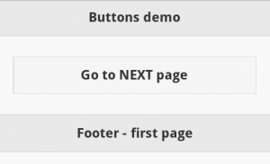
Example — UI buttons and the transitions between pages:
…
    <div data-role="page" id="pageone">
        <div data-role="header">
            <h1>Buttons demo</h1>
        </div>

        <div data-role="main" class="ui-content">
            <a href="#pagetwo" class="ui-btn">Go to NEXT page</a>
        </div>

        <div data-role="footer">
            <h1>Footer - first page</h1>
        </div>
    </div>

    <div data-role="page" id="pagetwo">
        <div data-role="header">
            <h1>Page 2</h1>
        </div>

        <div data-role="main" class="ui-content">
            <a href="#" class="ui-btn" data-rel="back">Go back</a>
        </div>

        <div data-role="footer">
            <h1>Footer - second page</h1>
        </div>
    </div>
…
The result running on Opera Mobile Emulator:
A full example here.
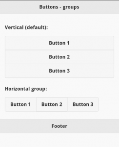
Grouping buttons
The buttons can be grouped in various ways.
…
      <div data-role="page" id="pageone">
          <div data-role="header">
              <h1>Buttons - groups</h1>
          </div>

          <div data-role="main" class="ui-content">
              <div data-role="controlgroup" data-type="vertical">
                  <p><strong>Vertical (default):</strong></p>
                  <a href="#" class="ui-btn">Button 1</a>
                  <a href="#" class="ui-btn">Button 2</a>
                  <a href="#" class="ui-btn">Button 3</a>
              </div>

              <div data-role="controlgroup" data-type="horizontal">
                  <p><strong>Horizontal group:</strong></p>
                  <a href="#" class="ui-btn">Button 1</a>
                  <a href="#" class="ui-btn">Button 2</a>
                  <a href="#" class="ui-btn">Button 3</a>
              </div>
          </div>

          <div data-role="footer">
              <h1>Footer</h1>
          </div>
      </div>
…
A sample view:
A full example available here.
Learning jQuery Mobile — icons
jQuery Mobile offers a standard set of icons, which we can easily use. Simply define an attribute for the element.
Example — using icons in jQuery Mobile:
…
<input type="button" value="Delete" data-icon="delete" />

<a href="#" data-role="button" data-icon="plus">Plus - link</a>

<button data-icon="minus">Minus - button element</button>
…
As you can see, we have 3 different icons assigned to three different HTML elements.
Icons as buttons:
<button data-icon="search" data-iconpos="notext">Search</button>

<a href="" data-role="button" data-icon="plus"
  data-iconpos="notext"></a>
A full example here.
Positioning icons
We may want to put an icon in a different location than the default, for example the other side of an element. Fortunately, in jQuery Mobile we can do it very simply.
Example:
…
<div data-role="main" class="ui-content">
  <p><strong>Test:</strong></p>
  <a href="#" class="ui-btn ui-icon-search ui-btn-icon-top">Top</a>
  <a href="#" class="ui-btn ui-icon-search ui-btn-icon-bottom">Bottom</a>
  <a href="#" class="ui-btn ui-icon-search ui-btn-icon-right">Right</a>
  <a href="#" class="ui-btn ui-icon-search ui-btn-icon-left">Left</a>
</div>
…
The position is set using CSS classes, that are available in the stylesheets attached to jQuery Mobile.
For example ui-btn is the general class of a button, ui-icon-search defines an icon, and ui-btn-icon-top — the position of our icon.
A full example here.
There is a lot of icons available in jQ Mobile, for example: plus, minus, delete, arrow-l, arrow-r, arrow-u, arrow-d, check, gear, refresh, forward, back, grid, star, alert, info, home, search, custom.
The full list of icons and examples you can find on W3Schools and related part of documentation:
http://www.w3schools.com/jquerymobile/jquerymobile_ref_icons.asp
http://demos.jquerymobile.com/1.2.0/docs/buttons/buttons-types.html
At the moment it’s all about the buttons and icons. Now I would like to mention the transition effects.
Transitions
jQuery Mobile provides no only UI elements, but also excellent transition effects (with animations).
Example:
<div data-role="page">
  <div data-role="header">
    <h1>Page one</h1>
  </div>

  <div data-role="content">
    <p>Hello, <a href="#second" data-transition="pop">
      open second page…</a>
    </p>
<!-- try others: slide, slideup, slidedown, fade -->
  </div>
</div>

<div data-role="page" id="second">
  <div data-role="header">
    <h1>Page two</h1>
  </div>

  <div data-role="content">
    Hello again!
  </div>
</div>
A full example available here.
The transition between the pages with one of the effects offered by jQuery Mobile, has a beneficial effect on the UX.
In our example we used the pop effect:
<a href="#second" data-transition="pop">…link…</a>
The choice is wider: slide, slideup, slidedown, fade, or flow.
A more complete list with examples on W3Schools:
http://www.w3schools.com/jquerymobile/jquerymobile_transitions.asp
We will present a few examples based on other elements of jQuery Mobile.
Other elements of the UI and further examples
Here we have 2 small examples of elements, that can enhance the UI of our projects.
Flip switch:
<div data-role="content">
  <form action="" method="post">

    <div data-role="fieldcontain">
      <label for="myflip">Flip switch</label>
      <select id="myflip" data-role="slider">
        <option>ON</option>
        <option>OFF</option>
      </select>
    </div>
  </form>
</div>
It might look like this:
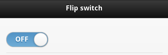
We can find this attractive and useful UI element frequently in mobile applications.
Collapsible elements
Thanks to data-role=”collapsible” we can easily create collapsible / expandable elements.
Example:
<div data-role="main" class="ui-content">
  <div data-role="collapsible" data-collapsed="false">
    <h3>Touch here</h3>
    <p>The content - first…</p>
  </div>

  <div data-role="collapsible" data-theme="b">
    <h3>Touch here</h3>
    <p>Hidden content - second…</p>
  </div>
</div>
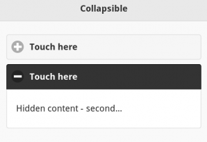
A full example here.
Note that we defined data-theme=”b” for the second element, which means a different style (colors).
For more examples, please visit following page:
http://www.w3schools.com/jquerymobile/jquerymobile_themes.asp
Thus, we end today’s review of many UI elements offered by jQuery Mobile.
Learning jQuery Mobile — summary
As we have seen, jQuery Mobile offers very large possibilities for creating UI elements and effects. And it’s comfortable to use for the programmer.
Thank you.
 Posted in
  Tags:
Tags: 