
Today we focus on further learning jQuery Mobile. We will discuss elements such as dialogs and lists.
Learning jQuery Mobile — next steps
We start with an important UI element — dialogs.
Basically, as in other cases, we rely on the definition of attributes for items.
For example:
<a href="foo.html" data-rel="dialog">Open dialog</a>
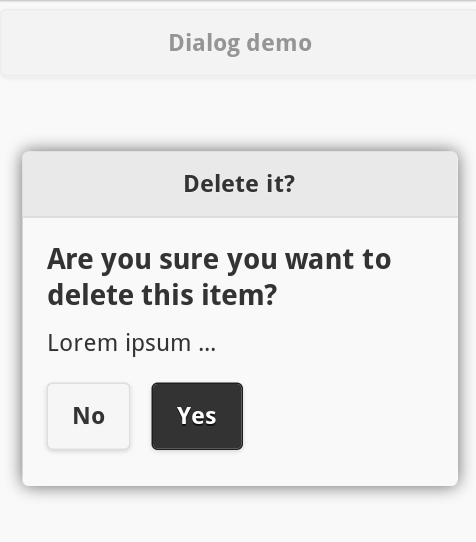
To see the jQuery Mobile dialogs in action, let’s consider the slightly larger example:
…
<a href="#dialog" data-rel="popup" data-position-to="window"
  data-role="button" data-transition="pop">Dialog demo</a>

<div data-role="popup" id="dialog" data-overlay-theme="a"
  data-theme="c">
  <div data-role="header" data-theme="a">
    <h1>Delete it?</h1>
  </div>

  <div data-role="content" data-theme="d">
    <h3>Are you sure you want to delete this item?</h3>
    <p>Lorem ipsum …</p>
    <a href="#" data-role="button" data-inline="true"
      data-rel="back" data-theme="c">No</a>
    <a href="#" data-role="button" data-inline="true"
      data-rel="back" data-theme="b">Yes</a>
  </div>
</div>
…
The result (running on Opera Mobile Emulator):
The full example here.
In the code above we see a lot of new attributes, but we obtained the effect with a little effort.
For those interested in delving into the topic of jQM dialogs:
http://demos.jquerymobile.com/1.2.0-beta.1/docs/pages/page-dialogs.html
http://api.jquerymobile.com/dialog/
Toolbars in jQuery Mobile
These elements are often found in header of applications, possibly in footer. Simply, they allow easy access to the options or navigation.
Example:
<div data-role="page">
  <div data-role="header">
    <a href="#" class="ui-btn ui-corner-all ui-shadow
      ui-icon-home ui-btn-icon-left">Home</a>
    <h1>Welcome!</h1>
    <a href="#" class="ui-btn ui-corner-all ui-shadow
      ui-icon-search ui-btn-icon-left">Search</a>
  </div>

  <div data-role="main" class="ui-content">
    <p>Demo … </p>
  </div>

  <div data-role="footer" style="text-align: center;">
    <div data-role="controlgroup" data-type="horizontal">
      <a href="#" class="ui-btn ui-corner-all ui-shadow
        ui-icon-plus ui-btn-icon-left">Option #1k</a>
      <a href="#" class="ui-btn ui-corner-all ui-shadow
        ui-icon-plus ui-btn-icon-left">Option #2</a>
    </div>
  </div>
</div>
Result:
The full example here.
More information and examples of toolbars:
http://www.w3schools.com/jquerymobile/jquerymobile_toolbars.asp
Going further we can meet navigation bars, i.e. the group of links arranged horizontally, typically used to create navigation elements.
Example:
<div data-role="header">
  <div data-role="navbar">
    <ul>
      <li><a href="#">Home</a></li>
      <li><a href="#">Contact</a></li>
      <li><a href="#">Search</a></li>
    </ul>
  </div>
</div>
The base is to define the appropriate role (data-role=”navbar”) for parent element.
More information and examples:
http://www.w3schools.com/jquerymobile/jquerymobile_navbars.asp
Panels in jQuery Mobile
Panel — another useful feature. They may appear dynamically on the side of the application and provide additional content.
It can be anything, e.g. menu with options. Great thing, very suited to mobile applications.
Example:
<div data-role="page" id="pageone">
  <div data-role="panel" id="myPanel">
    <h2>Panel!</h2>
    <p>
      <small>
        You can close the panel by clicking outside the panel,<br />
        pressing the Esc key or by swiping.
      </small>
    </p>
  </div>

  <div data-role="header">
    <h1>Page header</h1>
  </div>

  <div data-role="main" class="ui-content">
    <p>Click on the button to open the Panel.</p>
    <a href="#myPanel" class="ui-btn ui-btn-inline ui-corner-all ui-shadow">Open Panel</a>
  </div>

  <div data-role="footer">
    <h1>Page Footer</h1>
  </div>
</div>
The full example here.
More examples:
http://www.w3schools.com/jquerymobile/jquerymobile_panels.asp
Other
From here you can also know the other options, such as support for tables:
http://www.w3schools.com/jquerymobile/jquerymobile_tables.asp,
This feature of jQuery Mobile allow to (painless) create tables of data and filter them.
jQuery Mobile offers also grids
http://www.w3schools.com/jquerymobile/jquerymobile_grids.asp
which facilitate the deployment of UI elements.
Lists (list views)
jQuery Mobile list views are the next useful feature worth of learning.
Actually, they are based on normal HTML lists:
– ordered (<ol>),
– disordered (<ul>),
To create a list in jQuery Mobile, simply add the data-role=”listview” attribute.
Example — lists:
<div data-role="content">
  <h3>Unordered List:</h3>
  <ul data-role="listview">
    <li><a href="#">List Item</a></li>
    <li><a href="#">List Item</a></li>
    <li><a href="#">List Item</a></li>
  </ul>
  <br />

  <h3>Ordered List:</h3>
  <ol data-role="listview">
    <li><a href="#">List Item</a></li>
    <li><a href="#">List Item</a></li>
    <li><a href="#">List Item</a></li>
  </ol>
</div>
The full example here.
It’s good to improve appearance of the list by adding rounded corners and margins. This can be done by using attribute data-inset=”true”:
<div data-role="page" id="pageone">
  <div data-role="content">
    <h3>List with margin and rounded corners:</h3>
    <ul data-role="listview" data-inset="true">
      <li><a href="#">List Item</a></li>
      <li><a href="#">List Item</a></li>
      <li><a href="#">List Item</a></li>
      <li><a href="#">List Item</a></li>
    </ul>
  </div>
</div>
Result:
Filtering list in jQuery Mobile
List in jQuery Mobile are equipped with filtering options, so the programmer doesn’t need to implement this manually.
Example:
<form class="ui-filterable">
  <input id="myFilter" data-type="search">
</form>
<ul data-role="listview" data-filter="true" data-input="#myFilter"
  data-autodividers="true" data-inset="true">
  <li><a href="#">Audi</a></li>
  <li><a href="#">Alfa Romeo</a></li>
  <li><a href="#">BMW</a></li>
  <li><a href="#">Chevrolet</a></li>
  <li><a href="#">Chrysler</a></li>
  <li><a href="#">Ford</a></li>
  <li><a href="#">Fiat</a></li>
  <li><a href="#">Honda</a></li>
  <li><a href="#">Skoda</a></li>
  <li><a href="#">Suzuki</a></li>
  <li><a href="#">Toyota</a></li>
</ul>
To add list filtering, we have to define:
– data-role=”listview”,
– data-filter=”true”,
– and also the data-input=”#myFilter”, which defined ID of the input field.
We can also add a placeholder to this field:
<input id="myFilter" data-type="search"
  placeholder="Search for the car…">
Example:
The full example here.
List dividers
These elements allows us to better organize our lists, by grouping its elements. The effect could be observed in the previous example, thanks to the data-autodividers=”true” attribute.
Counters (Count bubbles)
They are used simply to display numbers associated with the list item, for example number of messages.
To add such counter, we use an inline element, such as span, which contains the number. Additionally we have to set the “ui-li-count” class.
Example:
<ul data-role="listview">
  <li><a href="#">Inbox<span class="ui-li-count">160</span></a></li>
  <li><a href="#">Sent<span class="ui-li-count">99</span></a></li>
  <li><a href="#">Spam<span class="ui-li-count">15</span></a></li>
  <li><a href="#">Trash<span class="ui-li-count">2</span></a></li>
</ul>
Result:
Lists with graphic elements
jQuery Mobile provides a lot of icons, which we can add to lists. Fox example:
<ul data-role="listview" data-inset="true">
  <li><a href="#">Default</a></li>
  <li data-icon="plus"><a href="#">data-icon="plus"</a></li>
  <li data-icon="minus"><a href="#">data-icon="minus"</a></li>
  <li data-icon="delete"><a href="#">data-icon="delete"</a></li>
  <li data-icon="false"><a href="#">data-icon="false"</a></li>
</ul>
Result:
Certainly, we can add out own, small icons:
<ul data-role="listview">
  <li><a href="#"><img src="start.png" alt="1" class="ui-li-icon">Start</a></li>
  <li><a href="#"><img src="stop.png" alt="0" class="ui-li-icon">Stop</a></li>
</ul>
or thumbnails:
<div data-role="content">
  <h2>List with thumbnails and text</h2>
  <ul data-role="listview" data-inset="true"
    <li>
      <a href="#">
        <img src="html5_e.png" />
        <h2>HTML5 - 1st</h2>
        <p>The first icon of HTML5 … Lorem Ipsum … </p>
      </a>
    </li>
    <li>
      <a href="#">
        <img src="html5_c.png" />
        <h2>HTML5 - 2nd</h2>
        <p>Another icon of HTML5 … Ipsum dolor … </p>
      </a>
    </li>
  </ul>
</div>
The full example here.
Lists are often used to create UI elements for mobile apps.
Events
Another important element of interaction with the user are events. We have already mentioned them in previous articles.
jQuery Mobile supports the work with the events typical for mobile devices.
For more information I recommend to check W3Schools:
http://www.w3schools.com/jquerymobile/jquerymobile_events_touch.asp
http://www.w3schools.com/jquerymobile/jquerymobile_events_scroll.asp
http://www.w3schools.com/jquerymobile/jquerymobile_events_orientation.asp
Additionally: jQuery Mobile Events reference:
http://www.w3schools.com/jquerymobile/jquerymobile_ref_events.asp
At the end — an extensive collection of jQuery Mobile examples:
http://www.w3schools.com/jquerymobile/jquerymobile_examples.asp
and additional resources:
http://www.w3schools.com/jquerymobile/jquerymobile_ref_css.asp
http://www.w3schools.com/jquerymobile/jquerymobile_ref_data.asp
Summary
In several recent articles we made an overview of the elements, and the possibilities offered by jQuery Mobile framework.
Now, let’s just create our own mobile projects! The perfect tool for this purpose we have already.
Thank you!
 Posted in
  Tags:
Tags: 